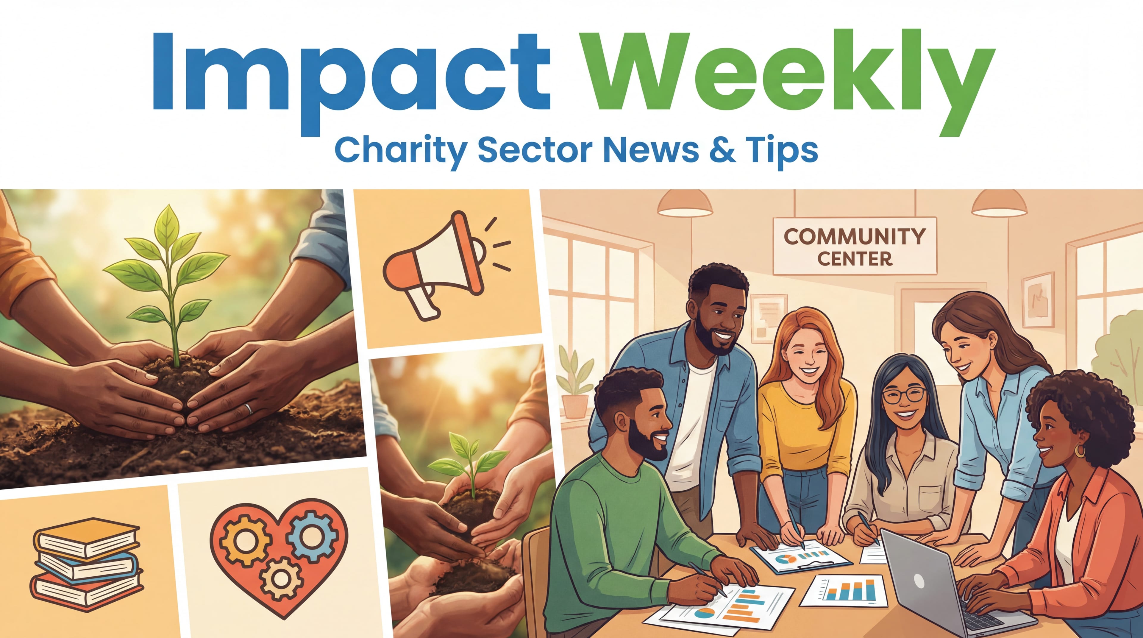
Impact Weekly: Scrollytelling & Live Dashboards

The era of the "annual report thump" (that sound a heavy PDF makes when it hits an inbox) is ending. In 2025, donors aren't just reading about impact; they expect to verify it. This week, we explore the "scrollytelling" trend that keeps donors glued to the screen, a simple dropdown rule to kill typos forever, and a free tool from Google that turns your dusty spreadsheets into live dashboards.
🏆 Data-to-Story: Impact Report Spotlight
10,000 Degrees: The Art of "Scrollytelling"
We've all seen static charts. But in their latest digital impact report, 10,000 Degrees an organisation dedicated to educational equity embraced "scrollytelling." As the user scrolls down the page, the data visualisations don't just sit there; they build themselves.
- The Hook: A simple bar chart representing student enrollment grows and branches out into complex demographic breakdowns as the reader moves through the narrative.
- The Logic: It mimics the way we tell stories verbally: setting the scene (the baseline number), then adding detail (the demographics), then the climax (the graduation rates).
Core Lesson: Motion captures attention. By revealing data in stages rather than all at once, you prevent "cognitive overload" and keep the donor focused on one specific insight at a time.
🛠️ Cleanup Corner: The Actionable Data Tip
The "Dropdown Discipline" (Killing Free Text)
The enemy of clean data is the "Free Text" field. If you give staff a blank box to type "California," you will get "Calif.", "CA", "Ca.", and "Cali". This makes filtering impossible.
The 3-Step Fix:
- Audit Your Forms: Look at your donation forms and internal CRM entry screens. Identify any field where the answers are finite (e.g., State, Referral Source, Payment Method).
- The "Pick One" Rule: Convert these text fields into Dropdown Menus (picklists). Force the user to select "CA" rather than typing it.
- The "Other" Trap: Be careful with the "Other" option. If you include it, require a secondary text field to explain, review these monthly, and add popular new options to the main dropdown list.
📈 Tool of the Week
Looker Studio: Your First "Live" Dashboard
You don't need an expensive enterprise license to start visualizing your data. Looker Studio (formerly Google Data Studio) is a powerful, free tool that connects directly to the Google Sheets or CSVs you already use.
- The Shift: Instead of emailing a static spreadsheet to your board every month, you send them one link to a Looker Studio dashboard.
- Why it wins: It updates automatically. When you add a new row to your Google Sheet, the charts on the dashboard update in real-time.
- Use Case: Build a simple "Donor Geolocation Map." Connect your donor address list, and Looker Studio will plot them on a map, showing you exactly where your support base is clustering—perfect for planning your next event.
Subject Lines:
- Is your annual report "scrolly" enough?
- Stop typing "CA" (The Dropdown Discipline)
- Turn your spreadsheet into a live map (Free Tool)
- 10,000 Degrees and the death of the PDF
- Data that moves: The new standard for 2025
Stay impactful,
The Mission Metrics Team
Related Articles